Supplier Analytics
Renamed: this is now Supplier Analytics (formerly “Factory Analytics”) — “factory” throughout the platform is now “brand / supplier”. The dashboard and behaviour are unchanged; “factory” below reads as “supplier”.
Supplier Analytics turns real platform activity into market-demand intelligence for suppliers/brands — what professionals are searching for, saving and specifying across catalogues, and which way the market is heading week over week. This guide explains every part of the dashboard: what each demand signal means, why it matters, how to read the momentum and rising/declining views, and — most importantly — what to do with each finding. It also covers the filters, CSV export, the sample-data state before you have activity, and which insights unlock on higher tiers.
How to open it: top navigation → Supplier Analytics (available to supplier accounts) — or open /factory-analytics.
1. What this page is for
What it is — a market-intelligence dashboard built for factory and manufacturer accounts. Why it matters — as designers, architects and other professionals discover products, save them to moodboards and add them to quotes, those actions become demand signals. This page aggregates and trends them so you can answer real commercial questions: which materials and categories are in demand right now? who is doing the buying? what is gaining momentum, and what is fading?
How it's sourced — the intelligence is drawn from across the platform, not just from your own catalogue, giving you a true read on the market you compete in. What you can narrow to — you can also focus the view on your own products where higher-tier comparisons are available.
How to read it as a whole: start with the headline cards for the current state, drop to Where the market is going for direction, then use Rising & declining to decide concrete actions — promote, stock, or expand. Set the filters first so every section reflects the scope you care about.
2. Headline demand signals
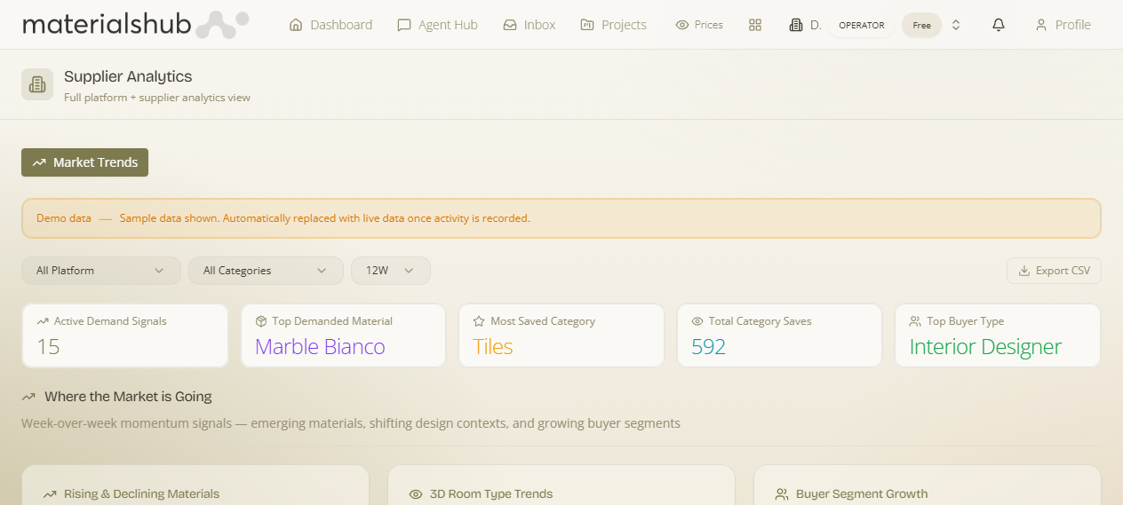
What it is — a row of summary cards at the top of the page. Why it matters — they give you the state of demand at a glance for the selected scope, category and time window — the dashboard's "is the market hot or cool, and where" summary before you dig deeper.
| Signal | What it tells you | How to act on it |
|---|---|---|
| Active Demand Signals | How many distinct materials are currently generating measurable interest — your overall measure of market activity. | A rising count means the market is broadening; a falling one means attention is narrowing onto fewer items. Use it as the baseline you read the other cards against. |
| Top Demanded Material | The single material attracting the most attention across the platform this period. | Make sure you can supply or substitute it — this is the item buyers are most actively looking at right now. |
| Most Saved Category | The product category accruing the most moodboard saves — where buyers are concentrating. | Prioritise range depth and availability in this category; it's where collecting intent is highest. |
| Total Category Saves | The total volume of saves in the current view, a measure of how much the market is actively collecting. | Read it as overall buying-intent temperature for the scope you've filtered to. |
| Top Buyer Type | The professional segment driving the most demand (for example interior designers, architects, sourcing agents). | Design and price for this audience — it tells you who to tailor your catalogue and messaging to. |
The figures shown in the screenshot are illustrative. Your dashboard reflects live platform activity for the scope and filters you choose.
3. Where the market is going (momentum)
What it is — a dedicated section that reads the direction of the market by comparing recent activity with the period before it. Why it matters — the headline cards are a snapshot of now; this section is the trend — it tells you where demand is heading next so you can get ahead of it rather than react to it. It surfaces:
- Emerging materials — items whose interest is accelerating, including materials the market is starting to ask for that may not yet be widely catalogued. How to act: a chance to be early — consider adding or promoting these before competitors saturate them.
- Shifting design contexts — which room types and project settings are growing or cooling. How to act: shows where your materials will be needed next, so you can position products for the contexts that are heating up.
- Growing buyer segments — which professional types are increasing their activity fastest. How to act: highlights audiences worth courting while their attention is rising.
4. Rising & declining materials
What it is — a ranked view of materials by save-velocity change — comparing saves over the most recent four weeks against the four weeks before. Why it matters — velocity (the change in saves, not the total) is what separates a material on the way up from one quietly fading, which is the single most actionable view for stocking and promotion decisions.
How to read it
- Materials trending upward are flagged as rising; those losing ground are flagged as declining.
- Fast-accelerating items carry an “Emerging” badge to call out genuinely new demand.
How to act on it
Read this alongside the headline signals to decide what to promote (rising items already getting attention), what to keep in stock (steady risers you don't want to run out of), and where to expand your range (Emerging items signalling demand you don't yet serve). Declining flags are your cue to wind down stock or refresh a tired line.
5. Filters & export
What it is — the controls above the dashboard. Why it matters — every signal and trend on the page is computed for whatever scope, category and window you set here, so the filters are how you turn a broad market read into one that's relevant to your business.
How to focus the analysis
- Platform scope — view the whole-platform market, or narrow to your own factory’s products where available.
- Category — limit the view to a single product category (tiles, wood, lighting, sanitary and so on) or see all categories together.
- Time window — choose how far back to look (for example the last 12 weeks).
- Export CSV — download the current material-trend table, including growth and a short forward projection, to work with the numbers in your own tools.
What it affects: changing any filter recomputes the headline cards, the momentum section and the rising/declining table together — so the whole page stays consistent with the scope you've chosen.
6. Sample data before you have activity
What it is — a clearly-labelled preview state. Why it matters — until enough real activity has been recorded for your scope and filters, you'd otherwise see an empty page — so the dashboard shows representative sample figures instead, letting you understand the layout before your own data arrives.
Until enough real activity has been recorded for your scope and filters, the page displays clearly-labelled sample data so you can see what the dashboard will look like. A visible badge marks this state. As genuine activity accrues, the sample figures are replaced with your live numbers automatically — no action needed.
7. Higher-tier intelligence
What it is — the deeper analyses gated behind higher subscription tiers. Why it matters — the signals covered above are available to all factory accounts; the tier-gated layers add comparison and segmentation that help larger manufacturers position against the wider market. They include:
- Geographic demand — where in the market interest is concentrated.
- Designer-engagement breakdowns — how specific professional segments interact with products.
- Competitive positioning — how your products compare against the wider market.
Factory Analytics is for factory accounts. Demand here originates from how the rest of the platform interacts with products — see Discover for the buyer-side experience that generates these signals.