Material Compare
Put two or more materials next to each other and judge them together — imagery and specifications lined up in one table — instead of flipping back and forth between separate detail pages. This guide teaches how to build a comparison, what each part of it means, what to weigh when deciding, and how to send a shortlist in from elsewhere.
How to open it: open your Profile menu (top-right) → Tools, then under Catalog tools (signed-in only) choose Material Comparison — or send a shortlist to compare from search results, the Knowledge Base, or a moodboard. Direct route: /compare.
1. What Compare is for
What it is — a side-by-side view for the final step of a decision. When you've narrowed a search down to a small shortlist, the question is no longer "what's out there" but "which of these is right". Why it matters — Compare is built for exactly that final step: it places your candidates side by side so you can scan their photos, attributes and specifications at a glance, and it draws your eye to the points where they actually differ — which is usually where the decision is made.
The limits, and why — you can compare two to four materials at once. Two is the minimum needed for a meaningful comparison; four is the ceiling so the columns stay readable.
What it affects elsewhere — Compare is the deciding stop in a flow that usually starts in search, Material Recognition, the Knowledge Base or a moodboard, and ends with you adding the winner to a moodboard or a quote.
2. What you can see for each material
What it is — every material you add becomes a column. At the top of the column you get its image, name and status, plus a small set of quality indicators; below that, two grouped sections of values run down the page so each row lines the materials up on the same attribute. Why it matters — knowing what each part of a column means is what lets you compare like for like instead of being misled by a thin record.
- Image & name — the material's main photo and title, so you're never comparing on numbers alone.
- Quality indicators — small bars for Quality, Confidence and Completeness. These describe how rich and well-verified the catalogue record is, which is useful context when one option simply has more (or better) data behind it.
- Properties — descriptive attributes such as colour, finish, material type and the like.
- Specifications — the more technical, measurable values where they exist.
What it affects — the quality indicators are your guide to how much to trust a sparse column; see section 5 for how to read missing values.
Differences are highlighted for you. Where a row's value is the same across all the materials it stays quiet; where the values diverge, the row is highlighted and flagged. A small legend at the bottom of the page explains the markers — one for "values differ", one for "values match" — so you can focus on the rows that matter to your choice.
3. The controls
What it is — the handful of controls you use to assemble and trim the comparison. Why it matters — building a clean comparison is mostly about adding the right columns and removing the wrong ones, so these four controls are the whole interaction.
| Control | What it does |
|---|---|
| Add Material | Opens a search box; type a name, pick a material from the catalogue, and it's added as a new column. Repeat to build up the comparison. The button stops appearing once you reach four — remove one first to add another. |
| Remove (×) | The × on a column drops that material from the comparison. Use it to clear out options you've ruled out and keep the table focused on the real contenders. |
| Back | Returns you to wherever you opened Compare from — for example your search results or a moodboard — so you can keep browsing. |
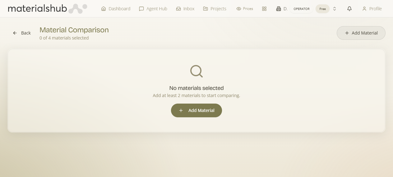
| Empty state | Before you've added anything, the page shows "0 of 4 materials selected — Add at least 2 materials to start comparing" with an Add Material button to get started. |
What it affects — Back returns you to the surface you came from with your browsing intact, so Compare slots into a wider session rather than ending it.
4. Building a comparison, step by step
What it is — the full flow from an empty page to a decision. Why it matters — following it in order keeps the table readable and your attention on the rows that actually decide the choice.
- Open Compare. If you arrive empty-handed you'll see the No materials selected state.
- Click Add Material, search by name, and select a material to place the first column.
- Repeat Add Material until you have two to four candidates side by side.
- Scan top to bottom: start with the images, then read down the Properties and Specifications, paying attention to the highlighted rows where the materials disagree.
- Remove (×) any option you've ruled out to keep the table clean.
- When you've decided, use Back to return to where you came from and act on your choice — add it to a moodboard or include it on a quote.
What it affects — the choice you land on here is what flows into your boards and quotes, so a clean comparison pays off downstream.
5. What to compare on
What it is — a way to prioritise what you weigh. There's no single "right" attribute — it depends on the project — but a useful order of attack is below. Why it matters — a deliberate order stops you over-indexing on one number and missing the obvious visual or data caveats.
- Imagery first. The fastest disqualifier is often visual: colour, texture and overall look should suit the space before any number matters.
- Then the specifications. Where measurable values exist, the highlighted differences are where trade-offs live — let the rows that diverge drive the conversation.
- Mind the data, not just the values. If one option's quality/completeness indicators are low, its blank or sparse rows may reflect a thin catalogue record rather than a genuinely worse material; treat missing values as "unknown", not "zero".
What it affects — reading the quality indicators (section 2) alongside the values keeps a sparse-but-good material from losing to a fully-documented-but-worse one.
6. Sending shortlists in
What it is — the ways to arrive at Compare with candidates already loaded. Why it matters — Compare is usually the last stop, so the heavy discovery should happen where it's natural and only the final judgement happens here.
Build the shortlist elsewhere, decide here. You can send a set of materials straight into a side-by-side view from search results, from the Knowledge Base, or from a moodboard — so the heavy discovery happens where it's natural and the final judgement happens here. To find candidates by photo or sample first, see Material Recognition.
What it affects — sending a shortlist in is the same as adding columns by hand, just faster; once they're loaded, the building, reading and deciding steps above are identical.
Compare reads directly from the catalogue, so it always shows the latest record for each material. If a value looks missing, open the material's own detail page from your search or the Knowledge Base for the full record.